What is Accessibility?
Accessibility refers to the ability to perceive, understand, navigate, and interact with electronic information and to participate actively in the digital world. The implementation of accessibility measures should take into consideration visual, auditory, physical, speech, cognitive, and neurological disabilities.
Our team started to discuss the aspects of universal and inclusive design. We went through some of the didibilities that people might have, and ensured that our website would be accessible for them as well.


How did we make it Accessible?
In order to facilitate accessibility, and secure that visually impeared people could navigate easilily through our website, we used a screen reader program, which uses a speech synthesizer to enable blind or visually impaired users to read the text displayed on the computer screen. Alongside this we also had in mind that our website should be navigable by keyboard for people with motor impairment. There are no time limits in the website, and we have used easy and understandable navigations and functions. In addition, we have made sure that the links and buttons are in good enough size.
The text we used avoided complex sentences and the link names were as short and precise as possible. Every link opens in a new tab, expect the ones linking the different pages. Another strategic thing our group was thinking about was using the correct heading hierarchy (<h1> <h2> <h3>). As a result, our website became more organized and more accessible to screen readers. Then we included ALL the text for all the pictures, which presented the draft we wanted to present with the picture.
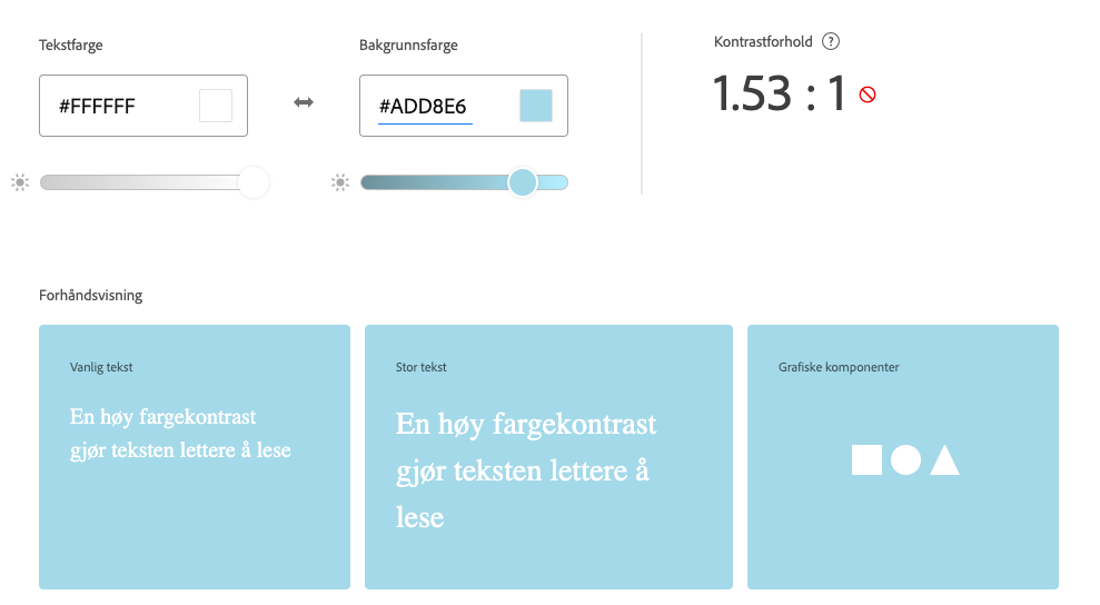
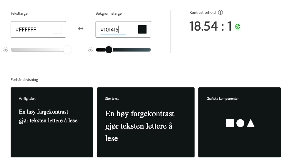
For color use, we used colors to separate and organize our content. Contrast is an important aspect, and to test this we used "Adobe color" contrast checker. This website made it easy for us to check how accessible the color usage is by entering the color for the background and text. (VIS BILDE). colorsafe.co - provided us with accessible color palettes based on WCAG Guidelines.
Testing of Accessibility:
Making your web and mobile apps accessible to as many people as possible is one of the objectives of accessibility testing. It can help those with disabilities, such as vision impairments, hearing impairments, and other difficulties, to use your apps. As for mobile devices, we added media queries to make sure the website would display smoothly on smaller screens. Since our navigation bar has five items, they would not be as neatly displayed on smaller screens. Instead, we made our burger menu clickable with JavaScript.
For the testing we used multiple of online accessible checkers, some of them was: Tingtun Checker, Wave, Achecker.
An example of a problem we faced can be seen in these pictures, when making our nav-bar we used the HTML tag "strong". This gave us an error so we decided to make the font weight bold in CSS instead.

